Sorry it's been a while, but life and a full-time job have been crazy of late... Enough about me though, let's get to it!
The other day I was called into an issue where the user needed a formula that would look up the results of specific tests based on the month that they were run. He wanted to enter a month into a cell and the formulas would return the values of the tests for that month. In response, I created a demo spreadsheet (No Macros) to show him how to get the result he wanted.
His initial question was "Is there a way to do this VLOOKUP()?". Yes, this could be accomplished with VLOOKUP() assuming the tables were organized appropriately, but I wanted to introduce a new method. VLOOKUP()is a great formula, but has it's limitations. For example, Column1 of the table referenced when looking for a specific value MUST be the left-most array column that contains that value...
While I'm sure there would be a convoluted way to go about accomplishing that task by counting the month from an original start date and using that as the column reference in the VLOOKUP() formula, I felt it would be a better time to use the INDEX() and MATCH() formulas to find the intersections of row and column.
Here's how I accomplished it:
Formulas:
INDEX(array, row_num, [column_num])
MATCH(lookup_value, lookup_array, [match type])
Data Set:
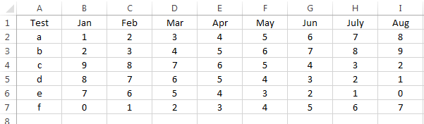
The user's file was set up so the column contains the test name (run only once per month and not duplicated) and the following columns are the results of the tests under each month.
Now, off to the right of the data set, I created an example of how to set up a quick reference for the month's data:
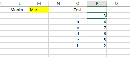
The Yellow cell is where the month is entered and cells P2:P7 contain the formulas that refer to the month and test name to return the appropriate value.
On to the formula... In cell P2, Start with the INDEX() formula. The array is the data table in cells A1:I7 so we now have:
=INDEX($A$2:$I$7,
The next step is to identify which row we're interested in. We use the MATCH() formula for this. The items we need for MATCH() are:
Lookup_value = O2 (this is the name of the test in question found in column "O")
Lookup_array = A2:A7 (This is the column containing the test names)
Match_type = 0 (zero - this means "Exact match with lookup_value)
So now we have:
=INDEX($A$2:$I$7,MATCH(O2,$A$2:$A$7,0)
Next, we need the column reference. Again, we use the MATCH() formula for this. The items we need for MATCH() are:
Lookup_value = M1 (this is the name of the test in question found in column "O")
Lookup_array = A1:I1 (This is the row containing the month names)
Match_type = 0 (zero - this means "Exact match with lookup_value)
Now, we have a completed formula in cell P2. Prior to copying the formula down, be sure to add the "$" where you need it to keep the references from shifting when they shouldn't - See the "Dollar Signs in Formulas" post if this doesn't make sense.
Final Formula:
=INDEX($A$2:$I$7,MATCH(O2,$A$2:$A$7,0),MATCH($M$1,$A$1:$I$1,0))
Now, when you change the Month in the yellow cell, the formula will match that month with each of the results and return the intersection or result of the test!
Now, I understand that this is not the only way to accomplish this task, nor is it the only way to use these formulas, but it IS the way I chose to solve the user's issue.
Using Microsoft Excel 2013, Everyday Excel 1-2-3 is designed to share some "everyday" experiences, tips or tricks for Microsoft Excel users. Target reader experience will range from Beginner to Expert and posts will often reach out to each group but not every group always. Comments are welcome and highly encouraged. Suggestions for topics are welcome, but solutions to specific problems will not necessarily be provided. Part of learning is struggling, and we're all struggling together.
Tuesday, April 15, 2014
Tuesday, March 25, 2014
Guest Contribution: Formula to Show Beginning of Week
Hey all! Today's post is provided by guest contributor Jerry Shelton. Jerry is a Project Manager at Hewlett Packard as well as an HP Sigma Plus Certified Black Belt. Lucky for us, he has provided a wonderful example of how to take a date/time stamp from a data set that was exported from a database and determine the beginning of the week to allow for simple grouping within a pivot table/chart.
This solution is a real-world example that was born out of the need of others that were not too excel savvy to create reports from data sources with similar formatting. This template allows them to simply copy/paste the formulas shown in this example into their own data and move from there with very little training or guidance from others. I fully support making life easier for others!
Here's a link to the file with the "How To" included inside:
Beginning of Week - Formula Example
**Note: The above file does not contain Macros.
Cheers!
This solution is a real-world example that was born out of the need of others that were not too excel savvy to create reports from data sources with similar formatting. This template allows them to simply copy/paste the formulas shown in this example into their own data and move from there with very little training or guidance from others. I fully support making life easier for others!
Here's a link to the file with the "How To" included inside:
Beginning of Week - Formula Example
**Note: The above file does not contain Macros.
Cheers!
Friday, March 21, 2014
Concatenation and Searching for text in a string
Today I was asked to create a unique identifier by obtaining the initials of a name and adding on the last 4 digits of a specific encounter number. This required the following functions:
Left(text, [num chars])
Mid(text, start_num, num_chars)
Right(text, [num_chars])
Search(find_text, within_text, [start_num])
and the symbol used to concatenate values/strings: "&"
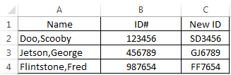
Here's the dataset:
Here we have the names list by LastName,FirstName and the ID#'s.
The assignment: "Provide Initials (First then Last) and the last 4 digits in the ID#"
**For this example, we're going to assume all of the names are in the exact same format down every row.
Let's Begin:
In Cell C1 we'll provide a column header of "New ID". In cell C2 we'll go to the formula bar and begin with our formula. Since the First initial is in the MIDDLE of the text string and and be found after a comma, we'll use the Mid() and Search() formulas here.
For the MID() formula we need to assign values to the following requirements -
=MID(A2,SEARCH(",",A2,1)+1,1)
This returns "S" in cell C2. Next, we need the First letter of the Last Name. This one is a bit more simple since it is the beginning letter of the text string. We'll use the LEFT() formula
For the LEFT() formula, we need to assign values to the following requirements:
The task I had to accomplish was a bit more complicated involving dates of service as well. The last step that you would want to do is validate that the "New ID" was truly unique across your data set. To accomplish this, you could simply create a pivot table, add the "New ID" and then Name as the Row values and add New ID to the values section as a count of New ID. This would quickly show if you have any duplicates by listing multiple names under the same ID.
Hope you enjoyed this tutorial! Instead of offering to donate lots of your money to me, let other people do it by clicking on an advertisement to the right!
Left(text, [num chars])
Mid(text, start_num, num_chars)
Right(text, [num_chars])
Search(find_text, within_text, [start_num])
and the symbol used to concatenate values/strings: "&"
Here's the dataset:
Here we have the names list by LastName,FirstName and the ID#'s.
The assignment: "Provide Initials (First then Last) and the last 4 digits in the ID#"
**For this example, we're going to assume all of the names are in the exact same format down every row.
Let's Begin:
In Cell C1 we'll provide a column header of "New ID". In cell C2 we'll go to the formula bar and begin with our formula. Since the First initial is in the MIDDLE of the text string and and be found after a comma, we'll use the Mid() and Search() formulas here.
For the MID() formula we need to assign values to the following requirements -
- text: the text we're referencing is the Name column and found in cell A2
- start_num: we need to search for the "," and start with the character immediately after it (+1)
- Search requires the following to be addressed:
- Find_text or Text to search for: "," (include the "" around the comma in the formula for this one)
- within_text: cell A2
- [start_num]: "1" - this is the first character in the cell A2
- num_chars: 1 - we only want the first letter of the first name
So, now that we have this written out in words, let's convert it to the formula:
=MID(A2,SEARCH(",",A2,1)+1,1)
This returns "S" in cell C2. Next, we need the First letter of the Last Name. This one is a bit more simple since it is the beginning letter of the text string. We'll use the LEFT() formula
For the LEFT() formula, we need to assign values to the following requirements:
- Text: A2
- [num_chars]: 1
This will provide the first character from the left using the value in cell A2. The formula looks like this:
=LEFT(A2,1)
So, we want all of this in one cell, right? How do we enter more than one formula? Concatenation!
All we have to do is combine the two formulas by replacing the "=" at the beginning of the second formula with "&" and append it to the end of the first formula:
=MID(A2,SEARCH(",",A2,1)+1,1)&LEFT(A2,1)
This now returns "SD" in cell C2. Last, we need the last four numbers in the ID#: We'll use the RIGHT() formula to accomplish this task:
For the RIGHT() formula, we need to assign values to the following requirements:
**Instead of looking at the left of the text, this formula starts at the right**
- Text: B2 - not A2, because the numbers are in B2!
- [num_chars]: 4
This will provide the first four characters from the right using the value in cell B2. The formula looks like this:
=RIGHT(B2,4)
Again, we want all of this in one cell, right? Let's concatenate by replacing the "=" with "&" and appending it to the end of the formula we've built so far:
=MID(A2,SEARCH(",",A2,1)+1,1)&LEFT(A2,1)&RIGHT(B2,4)
This now returns "SD3456" in cell C2. Let's look back at the assignment: "Provide Initials (First then Last) and the last 4 digits in the ID#"
Now that we know we've accomplished what we wanted, we can copy the values down the column and click SAVE!
The final result:
AND the final result showing the formulas used:
The task I had to accomplish was a bit more complicated involving dates of service as well. The last step that you would want to do is validate that the "New ID" was truly unique across your data set. To accomplish this, you could simply create a pivot table, add the "New ID" and then Name as the Row values and add New ID to the values section as a count of New ID. This would quickly show if you have any duplicates by listing multiple names under the same ID.
Hope you enjoyed this tutorial! Instead of offering to donate lots of your money to me, let other people do it by clicking on an advertisement to the right!
Tuesday, March 18, 2014
PowerPivot: BLANK() & ISBLANK()
Today I ran into an issue when writing a formula in the calculated column area. I needed to calculate the difference in minutes between two date/time columns. However, I first wanted to check to be sure both columns in the row had an entry to avoid some outrageous number appearing as the result of the formula.
In excel I would have simply handled this issue with an If() Statement check to be sure the cell wasn't blank and then returning "" if it was.
The formula in an Excel spreadsheet looks like this:
=if(A1="","",if(A2="","",(A2-A1)*24*60))
Unfortunately, when used in the data model this will return "#Error" for all rows in the column instead of a blank value.
After consulting with a coworker, he showed me how he has resolved this issue:
=If(ISBLANK([Column1]),BLANK(),if(ISBLANK([Column2]),BLANK(),([Column2]-[Column1])*24*60))
The ISBLANK() formula simply checks to see if the value in the column is blank. If it is, BLANK() returns the value as a blank cell - Much the same as using "" in an Excel Sheet formula.
To Explain the formula, I will write it in words:
If the value on this row of column1 is blank then return blank, otherwise go check if the value on this row of column2 is blank. If it is, return blank, otherwise calculate the difference between Date2 and Date1. Multiply the result by 24 to get hours. Multply the hours by 60 to get minutes.
Hope this helps someone else save some time!
In excel I would have simply handled this issue with an If() Statement check to be sure the cell wasn't blank and then returning "" if it was.
The formula in an Excel spreadsheet looks like this:
=if(A1="","",if(A2="","",(A2-A1)*24*60))
Unfortunately, when used in the data model this will return "#Error" for all rows in the column instead of a blank value.
After consulting with a coworker, he showed me how he has resolved this issue:
=If(ISBLANK([Column1]),BLANK(),if(ISBLANK([Column2]),BLANK(),([Column2]-[Column1])*24*60))
The ISBLANK() formula simply checks to see if the value in the column is blank. If it is, BLANK() returns the value as a blank cell - Much the same as using "" in an Excel Sheet formula.
To Explain the formula, I will write it in words:
If the value on this row of column1 is blank then return blank, otherwise go check if the value on this row of column2 is blank. If it is, return blank, otherwise calculate the difference between Date2 and Date1. Multiply the result by 24 to get hours. Multply the hours by 60 to get minutes.
Hope this helps someone else save some time!
Thursday, March 6, 2014
Question for the Audience...
Okay all, I have a problem that I don't know how to fix. HUGE points to one who has an appropriate solution.
The Problem: How do I default a text value slicer selection WITHOUT using VBA? Is it even possible?
Why no VBA? Our company is a bit behind the times in upgrading us all to the same version of office. I have Excel 2013, but the rest of the world is using 2007 (No slicers available). Therefore, I post my files to a SharePoint site and the end users are able to use them via Excel Services (hence the no VBA).
I am searching all over for this answer right now and will gladly share the how-to if/when I figure it out. I would gladly host a "Guest Post" if you know how to do this already.
Thanks!
The Problem: How do I default a text value slicer selection WITHOUT using VBA? Is it even possible?
Why no VBA? Our company is a bit behind the times in upgrading us all to the same version of office. I have Excel 2013, but the rest of the world is using 2007 (No slicers available). Therefore, I post my files to a SharePoint site and the end users are able to use them via Excel Services (hence the no VBA).
I am searching all over for this answer right now and will gladly share the how-to if/when I figure it out. I would gladly host a "Guest Post" if you know how to do this already.
Thanks!
Thursday, February 13, 2014
Convert Text to Columns - Separating Last, First Names
Have you ever had a set of data that you wanted to separate across multiple columns? "Text to Columns" is just for you!
Here is our Data Set:
The Request: "Please separate the client names into separate last name and first name columns"
This is SUPER EASY, so here we go...
1. Highlight the data you wish to separate
2. On the Ribbon, go to "Data" > "Text to Columns" in the "Data Tools" category
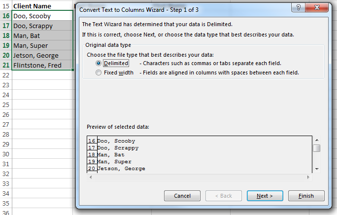
3. You should see this:
5. Place a check in the "Comma" Checkbox and deselect the others
6. Look at the Data Preview to see what the output will look like prior to proceding:
8. This screen will allow you to format the text by column. For this demonstration, we're happy with a "General" format (the default).
Here is our Data Set:
The Request: "Please separate the client names into separate last name and first name columns"
This is SUPER EASY, so here we go...
2. On the Ribbon, go to "Data" > "Text to Columns" in the "Data Tools" category
3. You should see this:
5. Place a check in the "Comma" Checkbox and deselect the others
6. Look at the Data Preview to see what the output will look like prior to proceding:
8. This screen will allow you to format the text by column. For this demonstration, we're happy with a "General" format (the default).
Wednesday, February 12, 2014
UPPER CASE, lower case, Proper Case
Today's post is about changing the case of your source text to UPPER CASE, lower case, or Proper Case.
Formulas we'll need:
=Upper() - ALL CHARACTERS IN UPPER CASE
=Lower() - all characters in lower case
=Proper() - All Characters In Proper Case
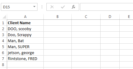
Here we can see that we have a list of names. Unfortunately, the names were simply entered without a specific format... Let's fix these:
In Cell B2 I'm entering "=Upper(A2)".
In Cell C2 I'm entering "=Lower(A2)".
In Cell D2 I'm entering "=Proper(A2)".
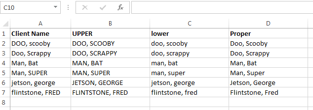
I then copy these formulas down to row 7 (or use auto-fill). Here's what we have:
As you can see, the formulas convert the text just as they should. So, how do we deal with this in a large table full of data?
Formulas we'll need:
=Upper() - ALL CHARACTERS IN UPPER CASE
=Lower() - all characters in lower case
=Proper() - All Characters In Proper Case
Here we can see that we have a list of names. Unfortunately, the names were simply entered without a specific format... Let's fix these:
In Cell B2 I'm entering "=Upper(A2)".
In Cell C2 I'm entering "=Lower(A2)".
In Cell D2 I'm entering "=Proper(A2)".
I then copy these formulas down to row 7 (or use auto-fill). Here's what we have:
As you can see, the formulas convert the text just as they should. So, how do we deal with this in a large table full of data?
- Insert a new column (temporary) next to the column with the text you wish to convert
- Use the desired formula in the uppermost cell (below the header) of the new column
- Copy the formula down the column or use auto-fill
- Copy the data in the new column
- "Paste Special" > "Values Only" to the original column - this replaces the original data with the newly formatted data.
- Delete the temporary column that you inserted,
Your data should now be formatted the way you want it. As always, if there is a step that you are not familiar with, please let me know and I can further explain.
Labels:
Excel,
Format Text,
Formula,
Lower Case,
Proper Case,
Text Case,
Upper Case
Thursday, January 30, 2014
Calendar Control
If you've ever had to create a data entry spreadsheet you know how important standardizing is.... That is, if you plan on having to do ANY analysis without having a huge clean-up job first.
Today's post is about dates and calendar controls.
For the longest time, I labeled my column with a header that looked something like this:
Date
(mm/dd/yyyy)
I was trying to indicate to the user that they should simply enter the date in the format that I had shown. YEAH, RIGHT! Apparently, that is asking too much. So what was I to do? Well, I looked online for solutions to my problem. Unfortunately, the solution often came as an add-in that would need to be locally installed/registered on every machine that would be using the calendar control. To begin with, I can't download and install files on my machine at work due to company policies. To add to the problem, my files are shared across our network and have been used by upwards of 100 different people. So, this was not going to work.
Therefore, I decided to create my own in VBA! Rough though it may appear, this little control does the trick nicely.
How it works:
I first built a calendar on the "CalendarControl" spreadsheet. This has a list of years and Months and drop-downs for each. The calendar days on the spreadsheet look at the year and month selected to determine what day the first date should appear on. The rest then follow suit. So, the calendar control is really just a prettied up Graphic User Interface (GUI) of the control on the spreadsheet.
Here is a pic of the calendar in action:
I have set up the calendar to initiate when the user double clicks in a cell that is in a date column (In this case, it is column E). The following code was added to the worksheet to get the calendar to only appear when the user double-clicks in colums E, L, and M:
Public Sub Worksheet_BeforeDoubleClick(ByVal Target As Range, Cancel As Boolean)
Select Case ActiveCell.Column
Case Is = 5
FrmCalendar.Show
Case Is = 12
FrmCalendar.Show
Case Is = 13
FrmCalendar.Show
Case Else
End Select
End Sub
The link below will allow you to download the Calendar Control file. I have successfully tested it in Excel Versions 2007, 2010, and 2013.
https://drive.google.com/file/d/0B_cZb61zmYEfY0NpbkFILUdZcUE/edit?usp=sharing
**NOTE: This is a "Bare Bones" copy of the tool ready for you to implement how you wish. The downloadable file is currently set up to add a date to whatever cell is active - This is why I added the worksheet code to only allow the calendar to launch when double-clicking in predetermined columns.
Feel free to change the code/form in any way you like. If you like these tools and/or posts, please refer you friends and colleagues!
As always, we're all working to be better at what we do, feel free to share comments and thoughts (But keep them professional, please!).
Today's post is about dates and calendar controls.
For the longest time, I labeled my column with a header that looked something like this:
Date
(mm/dd/yyyy)
I was trying to indicate to the user that they should simply enter the date in the format that I had shown. YEAH, RIGHT! Apparently, that is asking too much. So what was I to do? Well, I looked online for solutions to my problem. Unfortunately, the solution often came as an add-in that would need to be locally installed/registered on every machine that would be using the calendar control. To begin with, I can't download and install files on my machine at work due to company policies. To add to the problem, my files are shared across our network and have been used by upwards of 100 different people. So, this was not going to work.
Therefore, I decided to create my own in VBA! Rough though it may appear, this little control does the trick nicely.
How it works:
I first built a calendar on the "CalendarControl" spreadsheet. This has a list of years and Months and drop-downs for each. The calendar days on the spreadsheet look at the year and month selected to determine what day the first date should appear on. The rest then follow suit. So, the calendar control is really just a prettied up Graphic User Interface (GUI) of the control on the spreadsheet.
Here is a pic of the calendar in action:
I have set up the calendar to initiate when the user double clicks in a cell that is in a date column (In this case, it is column E). The following code was added to the worksheet to get the calendar to only appear when the user double-clicks in colums E, L, and M:
Public Sub Worksheet_BeforeDoubleClick(ByVal Target As Range, Cancel As Boolean)
Select Case ActiveCell.Column
Case Is = 5
FrmCalendar.Show
Case Is = 12
FrmCalendar.Show
Case Is = 13
FrmCalendar.Show
Case Else
End Select
End Sub
All the End User has to do is choose the Month/Year and click on the day. The control will automatically add the pre-formatted date to the active cell and then disappear to allow the user to continue entering data.
The link below will allow you to download the Calendar Control file. I have successfully tested it in Excel Versions 2007, 2010, and 2013.
https://drive.google.com/file/d/0B_cZb61zmYEfY0NpbkFILUdZcUE/edit?usp=sharing
**NOTE: This is a "Bare Bones" copy of the tool ready for you to implement how you wish. The downloadable file is currently set up to add a date to whatever cell is active - This is why I added the worksheet code to only allow the calendar to launch when double-clicking in predetermined columns.
Feel free to change the code/form in any way you like. If you like these tools and/or posts, please refer you friends and colleagues!
Thursday, January 23, 2014
(SOLVED) Slicer Selection in Chart Title without VBA!!!
So, I've been looking ALL OVER the internet to find a solution to this problem... Everywhere I look I read something like, "No, it's not possible" or "In a word, no". Well, that's just not good enough for me. I specialize in interim solutions and work arounds... SOoooo, after much research and trial and error, I've come up with a way to do just what we're all asking about - "How do I show the slicers selected in my Power Pivot chart?" Since we upload our files to SharePoint and the end users are using Excel Services because they're working with Excel 2007, we can't use VBA for any of our solutions that have a data model.
Here's what we'll need (Remember, I'm using Excel 2013, NOT 2010 with the Add-In):
Data in the Data Model
Pivot Table
Pivot Chart
Slicers (Connected to the Pivot Table)
Formulas:
Cubeset(Connection, Set Expression,[Caption],[Sort Order], [Sort By])
CubeRankedMember(Set)
IfError(Value, Value if Error)
Data: I'm using World population Data found at: http://www.census.gov/population/international/data/worldpop/table_population.php
I added a Decade column to assist me in quickly grouping the data by decade.
Now, I'm adding this table to the data model simply by:
Formulas:
Click on the chart title and in the formula bar type "=ControlSheet!$A$15"
You will see the this:
As you change the filters in the slicer, the title will change with it!
For the longest time I thought "Let's put the filters in the Title" was the best idea EVER!.. However, once I did it, I realized it wasn't a great Idea. If you have multiple slicers you've incorporated into your title it becomes WAY oversized and unruly. You see, when you link the title to the cell, ALL of the text is the same font size - you can't make the filter text smaller than the title text. For me, the title should be the focus and the filters just there if you need them.
Let's solve this: ADD A HORIZONTAL AXIS LABEL! - Since the data in this case is very self explanatory we don't need the axis label to describe the axis.
I hope you all enjoy this! It's been a royal pain trying to work without this solution, so if you share it, please share some of the credit with me if you reference this.
Thanks!
Here's what we'll need (Remember, I'm using Excel 2013, NOT 2010 with the Add-In):
Data in the Data Model
Pivot Table
Pivot Chart
Slicers (Connected to the Pivot Table)
Formulas:
Cubeset(Connection, Set Expression,[Caption],[Sort Order], [Sort By])
CubeRankedMember(Set)
IfError(Value, Value if Error)
Data: I'm using World population Data found at: http://www.census.gov/population/international/data/worldpop/table_population.php
I added a Decade column to assist me in quickly grouping the data by decade.
Now, I'm adding this table to the data model simply by:
- Highlight the dataset
- Click the PowerPivot Tab at the top
- In the Ribbon, click "Add to Data Model"
There are multiple ways to add data to the model. Typically I will connect directly to a data source instead of adding what I already have in the current spreadsheet, but that can be a discussion for another day.
Now that we have our data in the data model, let's stop and discuss a few very important details about the following steps. It is imperative that we create a pivot table linked to the data model and NOT just a pivot chart. The issue with linking a chart title or axis label to a cell can be bypassed simply by generating a pivot chart from a pivot table because it is then not directly linked to the data model. This was probably the BIGGEST issue with the whole process.. I discovered the issue when I right-clicked and selected "Pivot Chart Options" for both a chart based on pivot table and a chart based on the model. If you do this side-by-side, you will see that the chart connected to the data model has a window titled "PivotChart Options". However, if you do this with the chart based on the Pivot Table, you will see "PivotTable Options". Excel sees these charts differently. To simplify and summarize, you can do all things to a chart based on a pivot table that you could do with the chart based on a dataset in a spreadsheet. You cannot do this with a chart based on a data model.
Back to the DataModel:
Within the Data Model window click the following:
- Home Tab
- PivotTable > Pivot Table
- New WorkSheet > OK
Create your pivot table as you need it. If you're following me using the WorldPop data, I'm using:
- Rows = Decade
- Values = Average of Annual Growth Rate (%)
This is what we have:
Let's Add our Slicer. On the Ribbon Click:
- Insert
- Slicer (Found in the Filters Group)
If asked, link this to your data model. Select "Decade" from the column list under the table and click OK
Your slicer will look similar to this:
Link the slicer to the Pivot table by:
- Right-Click the Slicer
- Report Connections
- Check the Pivot Table you want the slicer to control
- Click OK
Now, Let's create our Pivot Chart:
- Click somewhere on your Pivot Table
- Under "PIVOTTABLE TOOLS" On the Ribbon, click "Pivot Chart"
- Let's choose a Clustered Column Chart
- Click OK
We now have:
I've selected a few of the slicers to demonstrate that the Slicer is working properly.
Now, to the fun part! How do we get the slicers selected to show on the chart?
Formulas:
CUBESET(Connection, Set Expression,[Caption],[Sort Order], [Sort By])
CUBERANKEDMEMBER(connection, set_expression, rank, [caption])
IFERROR(Value, Value if Error)
CUBERANKEDMEMBER(connection, set_expression, rank, [caption])
IFERROR(Value, Value if Error)
When I build scorecards and dashboards I prefer to have a control sheet that is hidden that contains formulas that I don't want other's to booger up. So I'm inserting a new sheet titled "ControlSheet" From here, the cell references will be in reference to sheet "ControlSheet"
**The formulas that follow differ slightly if you are using Excel 2010 (PowerPivot v1 and v2)- The "Connection" referred to in the Cubeset formula will always be "PowerPivot Data". "Connection" for Excel2013 is "ThisWorkbookDataModel"
In Cell A1, type the following:
- =CUBESET("ThisWorkbookDataModel",Slicer_Decade, "Decade")
I simply leave the sort options blank. This will populate Cell A1 with a linked reference to the DOS Quarter Slicer.
Next, In Cell A2, type the following:
- =IFERROR(CUBERANKEDMEMBER("ThisWorkbookDataModel",$A$1,ROW(Sheet1!A1)),"") - Remember, "Sheet1!" is the name of whatever sheet you're working in
The formula does the following:
This formula will always return the value in Cell A2, but will check to see if the following cells are blank before returning the value. If it's blank, then it returns a blank value. If it's not, it adds a comma and then the value of the cell.
In cell A14 copy/paste the following formula:
- If no slicers are selected, an error would be returned, so "IFERROR" returns a blank value.
- Otherwise, if all slicers are selected (no filter) the value will be "ALL"
- Otherwise, if one or more slicers are selected, the first value in the list of slicers will be returned
- Validate that your formula in cell A2 has the dollar signs around A1 ($A$1).
- Copy the formula down to cell A10 (or Auto-Fill).
- I typically use the "All Borders" Border around the range to indicate that the cells are being used even if they are blank.
Next, test your Slicer by Selecting Multiple Values and see what is returned by the formulas you've just created.
Now that we are "Catching" our slicers, we can Create a label like "Filters Used: " , concatenate the values and link to our chart.
Let's do it!
In Cell A12 on ControlSheet, Type "Filters Used - "
In Cell A13 Copy/Paste the following formula
- =A2&IF(A3="","",", "&A3)&IF(A4="","",", "&A4)&IF(A5="","",", "&A5)&IF(A6="","",", "&A6)&IF(A7="","",", "&A7)&IF(A8="","",", "&A8)&IF(A9="","",", "&A9)&IF(A10="","",", "&A10)
In cell A14 copy/paste the following formula:
- =A12&TRIM($A$1)&": "&TRIM($A$13)
You should see:
In cell A15 concatenate your Chart title with the value in Cell A14.. I prefer to add a line between (carriage return). My formula looks something like this:
="Avg World Population by Decade "&char(10)&A14
*Char(10) will add the carriage return we need
Now, let's return to Sheet1 and our chart...="Avg World Population by Decade "&char(10)&A14
*Char(10) will add the carriage return we need
Click on the chart title and in the formula bar type "=ControlSheet!$A$15"
You will see the this:
As you change the filters in the slicer, the title will change with it!
For the longest time I thought "Let's put the filters in the Title" was the best idea EVER!.. However, once I did it, I realized it wasn't a great Idea. If you have multiple slicers you've incorporated into your title it becomes WAY oversized and unruly. You see, when you link the title to the cell, ALL of the text is the same font size - you can't make the filter text smaller than the title text. For me, the title should be the focus and the filters just there if you need them.
Let's solve this: ADD A HORIZONTAL AXIS LABEL! - Since the data in this case is very self explanatory we don't need the axis label to describe the axis.
- Click on chart
- On Ribbon, Click "Design" in PivotChart Tools
- Click Add Chart Element
- Axis Titles > Primary Horizontal
- Click on the Axis Label on the chart
- Paste "=A12&TRIM($A$1)&": "&TRIM($A$13)" into the formula Bar
- Change the font size to "8"
- Change your Chart Title by simply typing the title in "Avg World Population Growth Rate (%) By Decade"
You should now see this:
I hope you all enjoy this! It's been a royal pain trying to work without this solution, so if you share it, please share some of the credit with me if you reference this.
Thanks!
Labels:
Data Model,
Dynamic Title,
Excel,
Pivot Chart,
Pivot Table,
Power Pivot,
Slicer
Friday, January 17, 2014
Favorite Excel Shortcut Keys
Hello all,
Here are a few of my most used/favorite short cut keys for Excel. Not having to always rely on using the mouse has made me much more efficient in my work.
Quick Functions:
Ctrl + V = Paste
Ctrl + X = Cut
Ctrl + C = Copy
Ctrl + Z = Undo
Ctrl + Y = Redo
Ctrl + S = Save
Ctrl + O = Open
Ctrl + P = Print
Ctrl + B = Bold
Ctrl + I = Italicize
Ctrl + U = Underline
Ctrl + T = Open the Insert Table Dialog box
Ctrl + F = Find
Ctrl + H = Find/Replace
F2 - Open/Activate a cells contents for editing
Alt + F4 = Close Current Window
Tab - Close Cell Editing and move 1 cell to the Right
Enter - Close Cell Editing and move 1 cell Down
For movement without using the Mouse:
Arrow directional Keys (Up, Down, Left, Right) = Move 1 cell in that direction
Ctrl + Home = Goto Upper-Left most cell in spreadsheet
Ctrl + End = Goto Lower-Right most cell in spreadsheet
Ctrl + [Arrow direction Key] = Goto the end of column/row or next empty cell in that direction
Ctrl + PageUp = Spreadsheet Tab to the Left
Ctrl + PageDown = Spreadsheet Tab to the Right
For Highlighting Cells:
Use the Movement Keys above, but hold "Shift" as well.
For a comprehensive list of shortcuts, go to the following Microsoft Link:
http://office.microsoft.com/en-us/excel-help/excel-shortcut-and-function-keys-HP010073848.aspx
Here are a few of my most used/favorite short cut keys for Excel. Not having to always rely on using the mouse has made me much more efficient in my work.
Quick Functions:
Ctrl + V = Paste
Ctrl + X = Cut
Ctrl + C = Copy
Ctrl + Z = Undo
Ctrl + Y = Redo
Ctrl + S = Save
Ctrl + O = Open
Ctrl + P = Print
Ctrl + B = Bold
Ctrl + I = Italicize
Ctrl + U = Underline
Ctrl + T = Open the Insert Table Dialog box
Ctrl + F = Find
Ctrl + H = Find/Replace
F2 - Open/Activate a cells contents for editing
Alt + F4 = Close Current Window
Tab - Close Cell Editing and move 1 cell to the Right
Enter - Close Cell Editing and move 1 cell Down
For movement without using the Mouse:
Arrow directional Keys (Up, Down, Left, Right) = Move 1 cell in that direction
Ctrl + Home = Goto Upper-Left most cell in spreadsheet
Ctrl + End = Goto Lower-Right most cell in spreadsheet
Ctrl + [Arrow direction Key] = Goto the end of column/row or next empty cell in that direction
Ctrl + PageUp = Spreadsheet Tab to the Left
Ctrl + PageDown = Spreadsheet Tab to the Right
For Highlighting Cells:
Use the Movement Keys above, but hold "Shift" as well.
For a comprehensive list of shortcuts, go to the following Microsoft Link:
http://office.microsoft.com/en-us/excel-help/excel-shortcut-and-function-keys-HP010073848.aspx
Numbers as text??
I was asked the other day about data exported from an access data base where the numbers where displayed as text values in Excel. If you have ever run into this, you know that it's not a super simple task to change the format of those cells to "Number", because after you change the format type of the cells to "Number", you then have to activate the cell (F2) and exit the cell (Enter/Tab) for every cell. So how do you get around this?
Let's use this example below:
Column A has Ages that are in a text format (notice the green triangle at the top-left of each cell - if you hover the cursor over this, excel will display a message that the numbers are in text format)
Simply add a new column next to the column you're working on (column B). In cell B2, type the formula "=A2*1". Auto-fill or copy the formula down the column.
The result of the formula will provide you with the numeric format of the age. Now you can simply copy the values in column B and "Paste Special > Values Only" in column A. The age column values are now Numeric and no longer Text.
Delete the new column (Column B) to restore your data to it's original structure.
Let's use this example below:
Column A has Ages that are in a text format (notice the green triangle at the top-left of each cell - if you hover the cursor over this, excel will display a message that the numbers are in text format)
Simply add a new column next to the column you're working on (column B). In cell B2, type the formula "=A2*1". Auto-fill or copy the formula down the column.
The result of the formula will provide you with the numeric format of the age. Now you can simply copy the values in column B and "Paste Special > Values Only" in column A. The age column values are now Numeric and no longer Text.
Delete the new column (Column B) to restore your data to it's original structure.
Wednesday, January 15, 2014
Dates and Pivot Tables
I was asked the other day how to show just the month within a pivot table row using a field that has dates formatted like "1/1/2014" throughout the year. As I discussed this further, I found out that it would be useful to have the month show and then all of the dates within that month below it.
Today we're going to address methods to accomplish these tasks:
#1 - In a cell or cells, how do I show only the month in a year? Let's Use "1/1/2014":
Use the following steps to create the desired table:
Last, since we're looking at dollars, let's format the "Sum of Price" column as currency:
There are lots of great ways to make data more meaningful through the use of pivot tables. In the future I will discuss using Power Pivot, data models, and slicers to be more efficient and effective in your work.
Today we're going to address methods to accomplish these tasks:
#1 - In a cell or cells, how do I show only the month in a year? Let's Use "1/1/2014":
- =Text([cell reference with date value],"mmm") = Jan
- "m" = 1
- "mm" = 01
- "mmm" = Jan
- "mmmm" = January
- =Month([cell reference with date value])
- This will give the number of the month = 1]
- Right-click on column with the dates > Format cells > Number Tab > Custom > Type = "mmm" (use one of the above)
#2 - In a pivot table, how do I group the dates by month in the row category?
First, let's check to see that our data table is ready for a pivot table... What are we missing? Well, in order for a pivot table to function properly and include all columns selected, each column must have a column header. In this data set, we're missing the header in column A. Let's add one and then insert our pivot table.
To insert a pivot table: Highlight your data table (A1:D9) > Insert > Pivot Table > New Worksheet > OK
Now, we're ready to include our dates in the Rows. Add the "Date of Purchase" field to the Rows area:
The Resulting table looks like this:
Now, lets group by the date:
- Click on a date in the pivot table
- Right-click the same date you just selected
- Click "Group..."
- For this example, choose both "Months" and "Years" (**to de-select an item just click it again!)
- Click OK
**Tip: If you are getting an error when trying to click "Group...", check to make sure that none of your cells in your date column are blank. Excel will not allow you to group with blank cells.
Now, Add the Price field to the values field in your pivot table. Your pivot table will now look like this:
The above example shows us how to group the data by year and month.
Now, how do we add the individual dates underneath the month? For this, we will need to make some additions to our table. Add the following formulas into the columns next to the table:
Auto-fill or copy/paste the formulas down to the end of the table.
*I'm also going to change the bottom date value to 2/2/2014 for purposes of this example.
Use the following steps to create the desired table:
- Highlight the data table
- Insert Pivot Table on a New Worksheet
- Add (in this order) Year, Month, Date of Purchase to the rows section of the pivot table
- Add Price to the values section of the pivot table
You now have a pivot table that groups the data By Year, By Month AND has individual line items under the month.
Last, since we're looking at dollars, let's format the "Sum of Price" column as currency:
- Double-click on "Sum of Price" column header in the pivot table
- Click the "Number Format" button at the bottom of the Value Field Settings pop-up window
- Choose "Currency" and your preferred format for negative numbers
- Click "OK"
You now have this:
There are lots of great ways to make data more meaningful through the use of pivot tables. In the future I will discuss using Power Pivot, data models, and slicers to be more efficient and effective in your work.
Labels:
Date,
Date Format,
Excel,
Format,
Grouping,
Pivot Table
Thursday, January 9, 2014
Creating a useful Process Chart (Using Excel 2013)
Today's post is about creating a Process Chart that will help you to visually identify areas of opportunity within a process. I work within the healthcare industry. It is often very important that we provide timely care in an effective manner. The chart example below is something that I developed for our team as we were trying to track times from patient arrival to the hospital to when each step was completed in our process, and ultimately, the time a given treatment was administered. When you already have an idea of how long a process should take, it becomes a matter of comparing expected times with actual times and identifying where the delays occurred - these are the opportunities that need to be investigated further to see what was different/caused a variation in the process for that individual case.
Alright, enough chit-chat - Let's DO IT!
Example Data Set:
It is important to note, that when tracking times, the time for each step needs to be in relation to the "start time" or a common point of reference. In this case, start time = 0.
Create the Chart:
Highlight the Data Set (Cells A3:G7).
Click "Insert" Tab at the top
In "Charts", select the "Line With Markers" chart
Right-click the white chart area (Up near the title works)
Click "Select Data"
Click "Switch Row/Column" button - this will place the process steps in the "Series" column and the attempts in the "Category" column.
Add Lines to indicate time between steps:
Left-click the chart
Go up to "Chart Tools" > Design
Click "Add Chart Element" on the Ribbon > Lines > Drop Lines
Remove series lines but leave the markers:
Click a Series line (Step1, Step2, etc...) > Right-click on the series line
Click "Format Data Series"
Click the paint can image and select "Line" in the options below the paint can.
Look at the chart:
Repeat steps to remove line for remaining series (steps).
Changing the Markers:
Click on a series marker on the chart - *Allow excel to select all of the markers in the series
Right-click on the marker
Click "Format Data Series"
Click the paint can image and select "Line" in the options below the paint can.
Below the paint can, click on "Marker"
Under "Marker Options" click the "Built-in" radio button
**Tip: You may also adjust the size of the marker and in the "Fill" section below "Marker Options" you can change the marker fill as well as adjust the border in the "Border" section - Play around with it, see what you like!
Repeat above steps to make each series' marker unique (but the same across each series).
You chart should look similar to this:
Add Data Labels to the final step, or top data series, in the process to show total time:
Click the data series at the top of the chart (Mine is the green triangle)
Right-click the series
Click "Add Data Labels" > "Add Data Labels"
Click on a data label to select all of the labels
Right-click on the data label
Click "Format Data Labels..."
In the format pane on the right, select the bar graph icon
Under "Label Position" select the "Above" radio button.
The labels are now "above" the markers.
**Tip: You can format data labels by clicking on them and using the ribbon at the top "Home" > "Font"
Last, Lets jazz up the chart a bit and make it a bit more presentation ready:
Chart Title:
[Insert name of the process here]
Source: [name of data source]
Last Updated: [Date/Time data was last updated]
**All of this goes into the single title text box - Just add a carriage return to add a new line. Once you've added the text, highlight the bottom two lines and change the font size to something like "8" to make it smaller. It's important information, but we don't want it to distract from the chart itself.
Adding Axis Labels - Be sure to label your axes appropriately!
Click on chart
Go up to "Chart Tools" > Design
Click "Add Chart Element" on the Ribbon > Axis Titles > Primary Horizontal/Primary Vertical
Change the Vertical Axis' text to "Time (Minutes)" or something similar.
**I am not including a horizontal axis label since the data and legend are self explanatory
The Final Chart will look something like this:
As you can see, this can be a very useful chart that allows us to identify where opportunities exist within a time driven process. It is very simple visually, and very easy to identify steps that are taking longer than others. If you have used something similar or have another spin on this, please share in the comments below: how it was used and what industry you're working in.
Alright, enough chit-chat - Let's DO IT!
Example Data Set:
It is important to note, that when tracking times, the time for each step needs to be in relation to the "start time" or a common point of reference. In this case, start time = 0.
Create the Chart:
Highlight the Data Set (Cells A3:G7).
Click "Insert" Tab at the top
In "Charts", select the "Line With Markers" chart
Right-click the white chart area (Up near the title works)
Click "Select Data"
Click "Switch Row/Column" button - this will place the process steps in the "Series" column and the attempts in the "Category" column.
Look at the chart:
Left-click the chart
Go up to "Chart Tools" > Design
Click "Add Chart Element" on the Ribbon > Lines > Drop Lines
Click a Series line (Step1, Step2, etc...) > Right-click on the series line
Click "Format Data Series"
Click the "No line" radio button
Look at the chart:
Repeat steps to remove line for remaining series (steps).
**Tip: If you do not close the "Format" pane after you select "No line", you can simply click on the next series line and format pane will remain open. This will allow you to quickly go through each series and remove the lines without the "Right-click" steps.
Changing the Markers:
Click on a series marker on the chart - *Allow excel to select all of the markers in the series
Right-click on the marker
Click "Format Data Series"
Click the paint can image and select "Line" in the options below the paint can.
Below the paint can, click on "Marker"
Under "Marker Options" click the "Built-in" radio button
Change the "Type" to a square marker
Repeat above steps to make each series' marker unique (but the same across each series).
You chart should look similar to this:
Add Data Labels to the final step, or top data series, in the process to show total time:
Click the data series at the top of the chart (Mine is the green triangle)
Right-click the series
Click "Add Data Labels" > "Add Data Labels"
Click on a data label to select all of the labels
Right-click on the data label
Click "Format Data Labels..."
In the format pane on the right, select the bar graph icon
Under "Label Position" select the "Above" radio button.
The labels are now "above" the markers.
**Tip: You can format data labels by clicking on them and using the ribbon at the top "Home" > "Font"
Last, Lets jazz up the chart a bit and make it a bit more presentation ready:
Chart Title:
[Insert name of the process here]
Source: [name of data source]
Last Updated: [Date/Time data was last updated]
**All of this goes into the single title text box - Just add a carriage return to add a new line. Once you've added the text, highlight the bottom two lines and change the font size to something like "8" to make it smaller. It's important information, but we don't want it to distract from the chart itself.
Adding Axis Labels - Be sure to label your axes appropriately!
Click on chart
Go up to "Chart Tools" > Design
Click "Add Chart Element" on the Ribbon > Axis Titles > Primary Horizontal/Primary Vertical
Change the Vertical Axis' text to "Time (Minutes)" or something similar.
**I am not including a horizontal axis label since the data and legend are self explanatory
The Final Chart will look something like this:
As you can see, this can be a very useful chart that allows us to identify where opportunities exist within a time driven process. It is very simple visually, and very easy to identify steps that are taking longer than others. If you have used something similar or have another spin on this, please share in the comments below: how it was used and what industry you're working in.
Labels:
Business Intelligence,
Chart,
Excel,
PI,
Process,
Process Improvement
Monday, January 6, 2014
VBA: Select Case
Alright VBA users... Have you ever needed to to use and if/then statement with multiple criteria and need to run a lot of code after the criteria is met? Well, Select Case is the code for you!
It looks like this:
Select Case [What you are evaluating]
Case is = [potential value]
'your code goes here
Case is = [potential value]
'your code goes here
Case is = [potential value]
'your code goes here
Case Else
'your code goes here
End Select
Let's put it to use. In this example, I am going to evaluate the value within cell B1. In my code, I personally prefer using the "Cells()" reference method over the "Range()" reference method. Cells(row, col) is what you'll see.
Select Case Sheets("Sheet1").cells(1, 2).value - This opens the "Select Case" Statement and shows that we're looking at the value of cell B1 or row1, column2.
Next, if the cell value is 1, 2, or 3 I want run specific code depending on the value.
Select Case Sheets("Sheet1").cells(1, 2).value
Case is = 1
[insert code here]
Case is = 2
[insert code here]
Case is = 3
[insert code here]
So what if the cell value isn't 1-3? Well, in that "case" (Pun!) you will use the "Case Else" Statement.
Select Case Sheets("Sheet1").cells(1, 2).value
Case is = 1
[insert code here]
Case is = 2
[insert code here]
Case is = 3
[insert code here]
Case Else
[insert code here]
Finally, when you are done adding cases and code, you need to close the Select Case Statement with "End Select"
Select Case Sheets("Sheet1").cells(1, 2).value
Case is = 1
[insert code here]
Case is = 2
[insert code here]
Case is = 3
[insert code here]
Case Else
[insert code here]
End Select
**Tips and tricks:
#1 - if you are going to be using VBA, pay attention to the formatting of the code. Think of your code as an onion (multiple layers, not that they stink or make you cry). Your opening statement is the outer layer (no indentation). As you move into the statement - for example from the "Select Case ..." to "Case is =..." you will press tab and indent to indicate that what is happening is happening within the Select Case Statement. The code you include if a statement is True would be indented twice. The "End Select" statement is referring to the "outer layer" so it is not indented to complete visual.
My code above in Blue is an example of this.
#2 - If you do not intend for anything to happen when a condition is met using the Select Case statement, simply do not place any code in the [insert code here] section and the program will resume by ending the select statement and continuing to the next line.
It looks like this:
Select Case [What you are evaluating]
Case is = [potential value]
'your code goes here
Case is = [potential value]
'your code goes here
Case is = [potential value]
'your code goes here
Case Else
'your code goes here
End Select
Let's put it to use. In this example, I am going to evaluate the value within cell B1. In my code, I personally prefer using the "Cells()" reference method over the "Range()" reference method. Cells(row, col) is what you'll see.
Select Case Sheets("Sheet1").cells(1, 2).value - This opens the "Select Case" Statement and shows that we're looking at the value of cell B1 or row1, column2.
Next, if the cell value is 1, 2, or 3 I want run specific code depending on the value.
Select Case Sheets("Sheet1").cells(1, 2).value
Case is = 1
[insert code here]
Case is = 2
[insert code here]
Case is = 3
[insert code here]
So what if the cell value isn't 1-3? Well, in that "case" (Pun!) you will use the "Case Else" Statement.
Select Case Sheets("Sheet1").cells(1, 2).value
Case is = 1
[insert code here]
Case is = 2
[insert code here]
Case is = 3
[insert code here]
Case Else
[insert code here]
Finally, when you are done adding cases and code, you need to close the Select Case Statement with "End Select"
Select Case Sheets("Sheet1").cells(1, 2).value
Case is = 1
[insert code here]
Case is = 2
[insert code here]
Case is = 3
[insert code here]
Case Else
[insert code here]
End Select
**Tips and tricks:
#1 - if you are going to be using VBA, pay attention to the formatting of the code. Think of your code as an onion (multiple layers, not that they stink or make you cry). Your opening statement is the outer layer (no indentation). As you move into the statement - for example from the "Select Case ..." to "Case is =..." you will press tab and indent to indicate that what is happening is happening within the Select Case Statement. The code you include if a statement is True would be indented twice. The "End Select" statement is referring to the "outer layer" so it is not indented to complete visual.
My code above in Blue is an example of this.
#2 - If you do not intend for anything to happen when a condition is met using the Select Case statement, simply do not place any code in the [insert code here] section and the program will resume by ending the select statement and continuing to the next line.
Thursday, January 2, 2014
Locked out of my file!
Have you ever password protected an excel file (Sheet Protection, Workbook Protection) only to forget the password when someone needs you to make a change 2 years later? Well, here's how to open it back up.
Open the file with Open Office Calc. Yep, that's it! Simple as that. You will be able to un-protect what you need to and get on with your day.
Nice and easy, right? On the flip side, it hopefully helps you realize just how vulnerable Excel data can be, so be careful.
Open the file with Open Office Calc. Yep, that's it! Simple as that. You will be able to un-protect what you need to and get on with your day.
Nice and easy, right? On the flip side, it hopefully helps you realize just how vulnerable Excel data can be, so be careful.
Friday, December 27, 2013
Dollar Signs in formulas
Let's discuss using dollar signs in formulas. What are they used for and how do we use them?
There are three different uses of dollars signs in formulas. In cell B1 we will insert the different "$" formula references to cell A1:
- =$A$1
- =$A1
- =A$1
What do these mean?
- =$A$1 - This means that if you copy this formula to any cell (example: D3) in any other column or row, it will still be and always be a reference to A1.
- =$A1 - This means that the column reference will always be "A", but the row will change based on the row of the cell you're placing the formula in. So, if you copy it to D3, then the value with show what is in $A3.
- =A$1 - This means that the row reference will always be "1", but the column will change based on the row of the cell you're placing the formula in. So, if you copy it to D3, then the value with show what is in D$1.
What do we use these for? Let's take a look:
In column "A" I have placed the values 1,2,3,4 in cells A1, A2, A3, A4. The values in cells B1 to C4 will be the result of copying that formula to each of those cells.
=$A$1
No matter where the formula is copied (B1:C4), the result is the value in "A1"
=$A1
The copied formula will always show a value from column "A", but the row will be based on the cell the formula is copied to.
For this next example, I changed the data a bit to show how the formula works. The typed values are in cells A1, B1, C1, D1. The formula will be copied to cells A2 to D5.
=A$1
As you can see, the formula maintains the values in Row 1 (Row has the "$"), but changes with the columns (Column "A" does NOT have a "$").
In conclusion, the use of the dollar sign "$" is very useful when you are planning on having to copy the formula across multiple cells. A properly placed "$" will allow you to ensure formula integrity.
Subscribe to:
Posts (Atom)