Showing posts with label Chart. Show all posts

Wednesday, November 18, 2015

How to list relationships between Slicers and Tables/Charts VBA

Yep, ANOTHER post... To be honest, I've been working on this solution for a while and was quite excited when I finally got it working.  So, now I get to share it with you!

Have you ever created a monstrosity of a dashboard that has MANY slicers and MANY charts?  Well, I have, and it gets to be unruly quite fast.

OR, have you ever had to take over a dashboard developed by someone who is no longer around to make modifications or support the file?  Again, I have and it can be a bit daunting to have to figure out what they were thinking and their organizational strategies. 

One of the biggest issues that I have had is knowing which slicers are connected to which charts.  Yes, I know you can look at each and every slicer, go to "Report Connections" and see what is checked, but how do you then quickly look at the other related slicers that should be connected to the same charts as the first? 

Sure you could grab a couple of snapshots or write them down, but I must admit, that doesn't work for me.  Or to quote a viral YouTube sensation "Ain't nobody got time for that!"

So, after much complaining and digging through the VBA object library and looking around the internet (where I found the incomplete start for this code), I have developed the following:

Option Explicit


Sub MultiplePivotSlicerCaches()
    Dim oSlicer As Slicer
    Dim oSlicercache As SlicerCache
    Dim oPT As PivotTable
    Dim oSh As Worksheet
    Dim Row As Integer
    Dim ObjChart As Chart
    Dim x As String
'Create New Worksheet & Table Structure
Sheets.Add.Name = "HIDDENSlicerConnections"
Sheets("HIDDENSlicerConnections").Cells(1, 1).Value = "Slicer Name"
Sheets("HIDDENSlicerConnections").Cells(1, 2).Value = "Pivot Parent Name"
Sheets("HIDDENSlicerConnections").Cells(1, 3).Value = "Pivot Name"
Sheets("HIDDENSlicerConnections").Cells(1, 4).Value = "Chart Title"
'Add Slicer Cache Name and Pivot Table Name
Row = 2
    For Each oSlicercache In ThisWorkbook.SlicerCaches
        For Each oPT In oSlicercache.PivotTables
            oPT.Parent.Activate
            Sheets("HIDDENSlicerConnections").Cells(Row, 1).Value = oSlicercache.Name
            Sheets("HIDDENSlicerConnections").Cells(Row, 2).Value = oPT.Parent.Name
            Sheets("HIDDENSlicerConnections").Cells(Row, 3).Value = oPT.Name

            If InStr(oPT.Name, "Chart") < 1 Then GoTo Skip
            Sheets("HIDDENSlicerConnections").Cells(Row, 4).Value = oPT.PivotChart.Chart.ChartTitle.Caption

Skip:
            Row = Row + 1
        Next
    Next
   
End Sub

This code will create a table on a new spreadsheet called "HIDDENSlicerConnections" and list out every slicer and the chart/table that it is connected to. 

The first file that I used this on, I discovered that with all of the filters and charts and tables, I had a combined 238 connections in my file.  Again, "Ain't nobody got time for that!" - Okay, I'm done quoting....maybe.

Hold on, this is a cool macro, but it's no more than a raw data puke! We need to make sense of it. 

Next step is to create a pivot table based on the dataset.  Highlight the whole dataset, insert > PivotTable.  I prefer to keep the table on the same sheet as the dataset so choose a location and click OK. 

Now, to organize the data.  Do the following:
Row = Pivot Name
Row = Chart Title
Column = Slicer Name
Value = Pivot Parent Name: COUNT()

This will now create a table that shows the chart/table name down the left and Slicer name across the top and show a "1" for each connection that exists. SWEET!  No more snapshots and no more writing!  I'm down with that.

Edit: To use the Macro, follow these steps:

  • Open your file > Press Alt + F11 to Open the VBA Editor
  • In the left-hand pane, find the VBAProject([YOUR FILE NAME HERE]).  
  • Right-click the "Microsoft Excel Objects" Folder and Select Insert > Module
  • Copy/Paste the code into the module.  
  • Click the "Play button" or Press F5 on the Keyboard to run the Macro.
If you are deploying your dashboard to SharePoint using Excel Services, your files cannot use Macros.  Simply continue to save as a .xlsx file and all will be well.  The Macro may not save, but you've already run it, and you can always find again right here on the blog!

Thursday, May 14, 2015

Show two labels on a single chart series

Just learned how to add a denominator at the base of a column on a column chart that shows an average (average is simply one example, but this could be used in multiple ways):


Note: I removed all identifying info from the image on purpose... 

Anyway, here's how to do it:

Create a chart for Average times and add the data lables above the columns.  

Now, add the second series that shows the count.  You will now have two Columns showing.  

Right-click the count series and set the overlap property to 100% and change the Count series' color to match the Average series' color.  The columns now overlap and look the same.  

Last, set the data label position for the count to show inside base. 

Anyway, thought I'd share.

Thursday, January 9, 2014

Creating a useful Process Chart (Using Excel 2013)

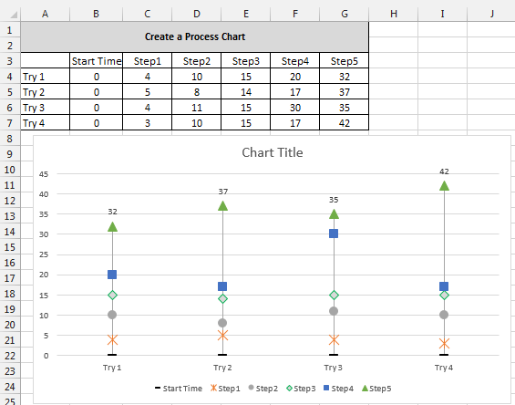
Today's post is about creating a Process Chart that will help you to visually identify areas of opportunity within a process.  I work within the healthcare industry.  It is often very important that we provide timely care in an effective manner.  The chart example below is something that I developed  for our team as we were trying to track times from patient arrival to the hospital to when each step was completed in our process, and ultimately, the time a given treatment was administered.  When you already have an idea of how long a process should take, it becomes a matter of comparing expected times with actual times and identifying where the delays occurred - these are the opportunities that need to be investigated further to see what was different/caused a variation in the process for that individual case.

Alright, enough chit-chat - Let's DO IT!

Example Data Set:
It is important to note, that when tracking times, the time for each step needs to be in relation to the "start time" or a common point of reference. In this case, start time = 0.


Create the Chart:
Highlight the Data Set (Cells A3:G7).
Click "Insert" Tab at the top
In "Charts", select the "Line With Markers" chart


Right-click the white chart area (Up near the title works)
Click "Select Data"
Click "Switch Row/Column" button - this will place the process steps in the "Series" column and the attempts in the "Category" column.


Look at the chart:


Add Lines to indicate time between steps:
Left-click the chart
Go up to "Chart Tools" > Design
Click "Add Chart Element" on the Ribbon > Lines > Drop Lines


Remove series lines but leave the markers:
Click a Series line (Step1, Step2, etc...) > Right-click on the series line
Click  "Format Data Series"

Click the paint can image and select "Line" in the options below the paint can.
Click the "No line" radio button


Look at the chart:


Repeat steps to remove line for remaining series (steps).

**Tip: If you do not close the "Format" pane after you select "No line", you can simply click on the next series line and format pane will remain open.  This will allow you to quickly go through each series and remove the lines without the "Right-click" steps.


Changing the Markers:
Click on a series marker on the chart - *Allow excel to select all of the markers in the series
Right-click on the marker
Click "Format Data Series"
Click the paint can image and select "Line" in the options below the paint can.
Below the paint can, click on "Marker"


Under "Marker Options" click the "Built-in" radio button
Change the "Type" to a square marker

**Tip: You may also adjust the size of the marker and in the "Fill" section below "Marker Options" you can change the marker fill as well as adjust the border in the "Border" section - Play around with it, see what you like!

Repeat above steps to make each series' marker unique (but the same across each series).

You chart should look similar to this:


Add Data Labels to the final step, or top data series, in the process to show total time:
Click the data series at the top of the chart (Mine is the green triangle)
Right-click the series
Click "Add Data Labels" > "Add Data Labels"
Click on a data label to select all of the labels
Right-click on the data label
Click "Format Data Labels..."
In the format pane on the right, select the bar graph icon
Under "Label Position" select the "Above" radio button.
The labels are now "above" the markers.

**Tip: You can format data labels by clicking on them and using the ribbon at the top "Home" > "Font"


Last, Lets jazz up the chart a bit and make it a bit more presentation ready:

Chart Title:
[Insert name of the process here]
Source: [name of data source]
Last Updated: [Date/Time data was last updated]

**All of this goes into the single title text box - Just add a carriage return to add a new line.  Once you've added the text, highlight the bottom two lines and change the font size to something like "8" to make it smaller.  It's important information, but we don't want it to distract from the chart itself.


Adding Axis Labels - Be sure to label your axes appropriately!
Click on chart
Go up to "Chart Tools" > Design
Click "Add Chart Element" on the Ribbon > Axis Titles > Primary Horizontal/Primary Vertical
Change the Vertical Axis' text to "Time (Minutes)" or something similar.

**I am not including a horizontal axis label since the data and legend are self explanatory

The Final Chart will look something like this:


As you can see, this can be a very useful chart that allows us to identify where opportunities exist within a time driven process.  It is very simple visually, and very easy to identify steps that are taking longer than others.  If you have used something similar or have another spin on this, please share in the comments below: how it was used and what industry you're working in.