Alright, enough chit-chat - Let's DO IT!
Example Data Set:
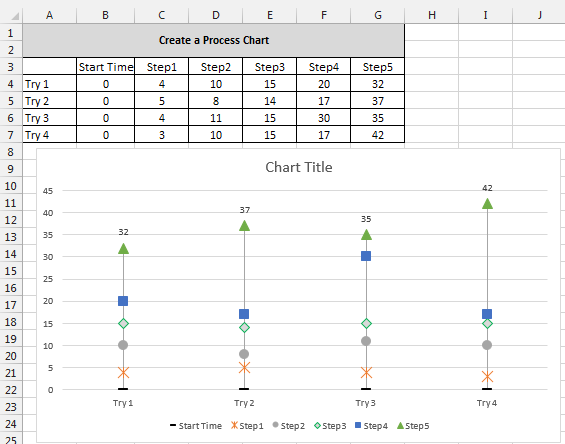
It is important to note, that when tracking times, the time for each step needs to be in relation to the "start time" or a common point of reference. In this case, start time = 0.

Create the Chart:
Highlight the Data Set (Cells A3:G7).
Click "Insert" Tab at the top
In "Charts", select the "Line With Markers" chart

Right-click the white chart area (Up near the title works)
Click "Select Data"
Click "Switch Row/Column" button - this will place the process steps in the "Series" column and the attempts in the "Category" column.

Look at the chart:
.PNG)
Left-click the chart
Go up to "Chart Tools" > Design
Click "Add Chart Element" on the Ribbon > Lines > Drop Lines


Click a Series line (Step1, Step2, etc...) > Right-click on the series line
Click "Format Data Series"
Click the "No line" radio button

Look at the chart:

Repeat steps to remove line for remaining series (steps).
**Tip: If you do not close the "Format" pane after you select "No line", you can simply click on the next series line and format pane will remain open. This will allow you to quickly go through each series and remove the lines without the "Right-click" steps.

Changing the Markers:
Click on a series marker on the chart - *Allow excel to select all of the markers in the series
Right-click on the marker
Click "Format Data Series"
Click the paint can image and select "Line" in the options below the paint can.
Below the paint can, click on "Marker"

Under "Marker Options" click the "Built-in" radio button
Change the "Type" to a square marker
Repeat above steps to make each series' marker unique (but the same across each series).
You chart should look similar to this:

Add Data Labels to the final step, or top data series, in the process to show total time:
Click the data series at the top of the chart (Mine is the green triangle)
Right-click the series
Click "Add Data Labels" > "Add Data Labels"
Click on a data label to select all of the labels
Right-click on the data label
Click "Format Data Labels..."
In the format pane on the right, select the bar graph icon
Under "Label Position" select the "Above" radio button.
The labels are now "above" the markers.
**Tip: You can format data labels by clicking on them and using the ribbon at the top "Home" > "Font"
Last, Lets jazz up the chart a bit and make it a bit more presentation ready:
Chart Title:
[Insert name of the process here]
Source: [name of data source]
Last Updated: [Date/Time data was last updated]
**All of this goes into the single title text box - Just add a carriage return to add a new line. Once you've added the text, highlight the bottom two lines and change the font size to something like "8" to make it smaller. It's important information, but we don't want it to distract from the chart itself.

Adding Axis Labels - Be sure to label your axes appropriately!
Click on chart
Go up to "Chart Tools" > Design
Click "Add Chart Element" on the Ribbon > Axis Titles > Primary Horizontal/Primary Vertical
Change the Vertical Axis' text to "Time (Minutes)" or something similar.
**I am not including a horizontal axis label since the data and legend are self explanatory
The Final Chart will look something like this:

As you can see, this can be a very useful chart that allows us to identify where opportunities exist within a time driven process. It is very simple visually, and very easy to identify steps that are taking longer than others. If you have used something similar or have another spin on this, please share in the comments below: how it was used and what industry you're working in.
No comments:
Post a Comment